Image courtesy of Facebook
After testing changes to the page layout for months, Facebook has made an official update.
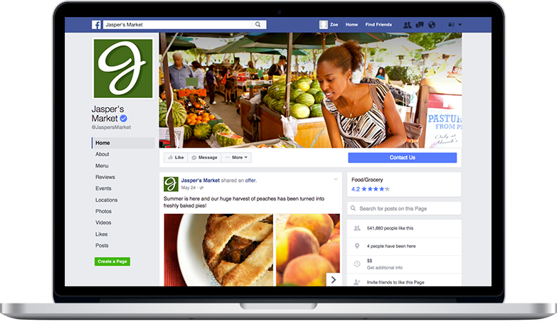
The clutter has gone from the Facebook header image - it's now a lovely clean space to work with and gives you a lovely place to make an impact.
1. Updated Layout
Your profile photo no longer overlaps with your cover photo. So if you’ve been doing something creative that integrates the two, just a heads up.
Facebook says that the cover photo dimensions remain the same (828px x 315px) with the profile photo displaying a square 160px x 160px. The page name and username are now displayed under the profile photo on the left instead of being an overlay on top of the cover photo.
You have full space to use for the design. Profile picture shifts to the top left with page name & @username below. Your page stats is a giant section (visible to Admins only) above the wall. Page category, likes, About section, Reviews, 3 featured apps, videos, etc. shift to the right column. No right rail ads.
TIP: Updated image size 828 x 475
Mari Smith, FB expert, recommends you use a size of **828 pixels wide by 475 pixels deep** to make this work on mobile as well as desktop - on mobile the profile pic still sits over the header image so you need to make the image deeper than usual.
2. More Prominent Buttons
If you’re using a call-to-action button, it’s now bigger, brighter and more prominent. Your CTA will appear as a large blue button on the right hand side of the page.
3. Improved Navigation
Tabs now appear as a list of links down the left hand side.
In general, this design is much cleaner. Other items that were previously on the left side are now on the right. Facebook has also removed ads from the right side of pages (they still exist on the right side across other real estate on Facebook).
Note the Message button icon shifts from a wee square chat icon to the actual Messenger logo. And the 3 dots now has a 'More' label, which is good. (People can save your page, suggest edits for location pages, write a review, like as their page, etc.)
Leave a comment
Also in eCommerce Success Blog
Creating SEO Magic: Your Ultimate Guide to Product Page Optimization in 2025
By Veronica Jeans, Bestselling Author February 23, 2025
Pure SEO Magic!
Continue reading
The Truth About Marketing in 2025: An eCommerce Reality Check
By Veronica Jeans, Bestselling Author February 10, 2025
What's Really Going On Out There
Continue reading
3. How To Get Paid From Your Payment Provider In Shopify?
By Veronica Jeans Shopify Queen & Bestselling Author February 05, 2025
Continue reading